Monday, July 29, 2013

Leela

                 As an artist it is my purpose and style to want to put down into a piece my feelings about it and portray the essence of the subject. Sometimes pieces call out to me to put more details in them while other times I feel the need to restrain. Leela is not an effort at minimalism but a revelation on getting down to the essence of a piece.


               My intention of simplicity in this piece was to bring out the beauty in this very ordinary table. Of course simplicity is a relative description and means different things to different people. To me it meant achieving an elegance in form, in design, in the details, and color while staying with the core idea of an ethnic representation. This by the way I consider to be difficult…for ancient Indian work from the period of the Mughals, the Rajputs, Pandyas, Cholas, or the Vijayanagara empire was well known for its opulence, extensive details, and extravagance and not simplicity.


             And this simplicity was achieved by a lot of forethought and planning. It took me a lot of effort to achieve this simple elegance, than to add more details and fill open surfaces with elaborate painting. I had to stay away from adding too much details, choose to paint only what really mattered, while still keep the interest. Too much simplicity and bareness would have made this piece boring. I have fielded suggestions and questions on this piece to the effect of….”why not add something on the top?”, “you can draw well, why don’t you paint something different?”, or “you should have used some other color”. It’s important to know when to stop in an artistic work; the statement that was made with just this much would have been diluted if I had added more. I also like to step away for a while or simply ‘sleep on it’, it helps to reinforce the trust in my ideas and thinking.


                 This piece reminds me a lot of a picture I have of my mother from before she got married. The simplicity and beauty that I feel in this picture always came to mind when I was working on Leela. In fact, I named this piece Leela as a reference to a conversation I remember having with Ma when she talked about Leela Naidu, one of her favorite Indian actresses and the elegance, grace, and simple style Leela Naidu portrayed that appealed to all. With the same last name, Ma felt related to her though they had never met. All these adjectives that Ma used for one of her favorite actresses, I find exuding from her own picture along with an embrace of love and warmth.

                     I don’t think you set out to achieve a simple piece; but in understanding the piece, the purpose it would be used for, the other accompanying pieces in the room; you approach the end result as a by-product of your work. Simplicity for the sake of it will fail….it has to resonate within and have meaning.


Wednesday, July 17, 2013

Jodha

I have been influenced by paintings I have seen in books, and in museums, not because they defined success but because they suggested possibilities - Eleanor Blair


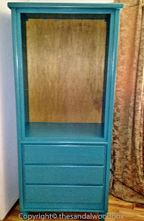
Jodha: After
              Jodha was a project that took longer to get started on than to complete. That’s because I had to find a suitable cabinet with the right dimensions for the intended space and a piece which would then be reinvent-able into an ethnic representation of India or the Mediterranean. I usually look for pieces with good ‘bones’ as I know that the final look be it global, modern, contemporary, or transitional can be achieved through cosmetic finishes.
             
Jodha: Before

            After months of diligent tracking on craigslist, I finally bought this piece. I was so excited to finally have my visual within completion. Though this piece had no color, it did have some finish on it and so I did a light sanding of it and since it has fairly large surfaces, I used a palm sander for this process. I did not use a wood filler to patch any holes or dents. I wanted the final piece to have some wear and tear visible (you’ll see why later).
             This piece was a floor-sitting cabinet. To make it look like a piece of furniture I added feet to the cabinet and to add the feet I had to build a frame for the feet to be attached onto and for the cabinet to sit on. I used heavy compressed wood cut to the size of the cabinet bottom, used wood glue to hold it in place and nails for tighter seamed edges.

Jodha: Midway
              Now that all the prep work was done…the piece was ready for some paint. I chose ‘teal zeal’ paint and primer-in-one interior satin enamel for this. Don’t hesitate to paint a new or vintage piece…every furniture in a room can’t be brown. I rolled on the paint using a roller brush, letting it completely dry between coats and this piece needed 3-4 coats. When painting furniture do paint the backs and tops of the piece and drawers even if they are not visible or will be facing the wall…..it just makes it look professional.
               Again this piece too had no knobs and pulls and so holes in the doors and drawers had to be drilled for them. For embellishment I used stencils and a pouncer brush to complete the design on the doors and drawers. My thinking in keeping the stencil and painting details to a minimum was to let the color speak for itself. I did not want to weigh the room with both a bright color and heavy detailed painting work. Also the room this piece is used in has a lot of patterns and colors in it. I needed this piece’s simplicity to ground all the other choices in the room and still stand tall.
              I then used Martha Stewart’s Specialty Finish Metallic paint in Cast Bronze for the antiquing process. Using a rag cloth I rubbed this bronze paint into the edges, corners and nooks, and all the dents and scratches I could find. This antiquing process darkens all the imperfections and details of the furniture making it seem as if it has been used for ages.
               I bought knobs and spray painted them bronze which brought out their details too. In hindsight, I might have liked to have used pulls for the doors instead of knobs but that is an easy fix if I want to make that change. Simply screwed the knobs in the pre-drilled holes and Jodha was done! I love how this turned out. And I use it to keep my sarees and Indian wear, stoles and shawls, jewelry, and other such goodies all interspersed with sandalwood pouches….it’s my very own sandalwood box.
               One of the big things of relevance in this project is ‘color’. I love color …especially deep rich colors and I am not afraid to use it. Bold bright colors are not just for kids’ rooms. They can be used in a restrained manner but with major pop to achieve decidedly adult rooms. If you are apprehensive to go bold in your design and décor choices, try starting small. Then it’s not such a big or permanent commitment. How about a bright color on just one piece of furniture to brighten up the whole room, or painting just one feature wall a bold contrasting color, or simply, start really small with brightly colored and patterned accessories like cushions, vases, and lamp bases.

Give color a go!

Wednesday, July 3, 2013

A Quick Weekend Project

             This past weekend I completed a quick redo of a nightstand. I found this piece of furniture in a friend’s giveaway pile. She had found it at a garage sale recently but had not found any significant use for it. Anyway, it looked suitable for use as a nightstand in my daughter’s room and so I brought it home.


           It seems to have been hand built by someone but was now in a pretty beat up state and had no hardware whatsoever. I did not want to spend too much time on it (the high heat in my garage workspace might be a reason) and so chose several short cuts for this project.

             I opted to not sand this piece even though it had a glossy finish on it. Instead I used Zinsser123 to prime the table. I put on one very even coat of the primer using a bristle brush for the open surfaces and a foam brush for the tighter spaces and let it dry thoroughly (which was very quickly because of the heat this past weekend). I had some leftover paints from previous projects that I wanted to use. I painted on two coats of the chosen deep blue color on the outsides and for a pop of surprise, a lighter blue on the insides of the drawers. While I let it all dry completely, I made a visit to my local home improvement store and chose these clear knobs for a modern look...and besides I liked the way the blue reflected off the clear knobs. Since the original piece had no hardware, I had to drill a single hole in each drawer face for the knob.


             I was going to stop at this point, screw on the knobs, and call the piece complete but it seemed to be missing something. It needed some more interest…so I used painter’s tape and taped off a simple rectangular outline on the drawer face. I filled in between the tape with the same light blue as the insides of the drawers. Remember to peel off the tape just when the paint is tacky and not completely dry as this ensures clean bleed free lines. After that dried, I screwed on the knobs and it was done.

        All in all this project involved the use of supplies I already had, took only a few hours to complete, and additionally cost only the purchase of the two knobs. Such short quick weekend projects are so instantly gratifying!